Art Projects
Generative Video
Artist Info / CV
Screensavers
evilcomputergenius
Resume
Blog 2005-2010
Blog
About
Don Relyea's Blog
I like to write about interesting art projects,
so give me a heads up if you have new project
and I'll write about it.

Don Relyea
email:
don(at)donrelyea.com
- art (215)
- baby (10)
- ebay (10)
- fossils (1)
- funny (4)
- general (15)
- kids (2)
- koi_pond (9)
- music (30)
- net_activism (1)
- photography (2)
- pmmg (2)
- screensavers (7)
- technology (2)
- video_art (23)
Blog RSS Feed

Art RSS Feed
Music RSS Feed
Screensavers RSS Feed
Add my blog to your
Google home page

Blogs:
Chris Ashley
Tom Moody
BLDG blog
Walker Art Center
turbulence.org
collisiondetection.net
She Dreams in Digital
kevan.org
2blowhards.com
thinking about art
artblog.net
the generator blog
The Presurfer
Mike Butler
Erik Smartt
patentlysilly.com
angrypirate.com
Chris Jagers
Paperback Writer
lifehacker
Mark Gould
asquare.org
m.d. mcmullin
amovablefeast
accuracy and aesthetics
phawker.com

Bombshell

Agendas Under Fire

110th Assembly

Meret Oppenheim portrait

Image Reconstruction

Ready Made Glitch

Slit Scan 3d Images

Systemic Sky

Slit Scan Photography

Monochrome Generator

Space Filling Curve Art

Hair Particle Drawing
Arts and New Media
Sect of Homokaasu
Roman Verostko
Jared Tarbell
Marius Watz
Juergen Schwietering
MIT Media Lab
eyebeam.org
ARS Electronica
mocoloco.com
rhizome.org
runme.org
core77.com
IAAA
furtherfield.org
Cory Arcangel
Philip Galanter
Roy Stanfield
Adrian Ward
ambienttv.ne
Alex Dragulescu
toxi
generator x
database of virtual art
Blast Theory
Institute for Applied Autonomy
0100101110101101.org
Bathsheba Grossman
Ariel Malka
BLF
Art Crimes
Buff Monster
Hactivist
rtmark
Faile
Mute
Crumb
the Yes Men
Marcel
X257.com
moma
amoda.org
artforum
metropolismag.com
neural.it
EFF
{G2}
Kate Armstrong
no-org.net
mnartists.org
Casey Reas
Vlad_Nanca
digitalsouls
Transmediale
Media Art Net
treasurecrumbs
Art Interactive
Electronic Arts Intermix
artsjournal
MTAA
Suzanne G
onreact
Wooster Collective
computergraphica.com
hardisco.com
inhabitat.com
c505
recyclart
ultra eczema
Kris Davidson
Robert Spahr
drainmag.com
Thor Johnson
Tue, 27 May 2008
500x Open Show 2008: Something Made Easy
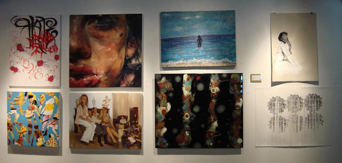
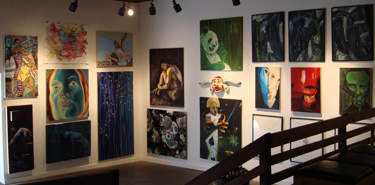
From Kerin Arn's several large prisma color genitalia to the subtle humor in the way the members arranged the works, this years 500x Open Invitational Show was a well hung show indeed. Wandering through I could see logical groupings of the works and got a chuckle when I saw some safari photographs adjacent to a painting of a boy hunting a lion with a pellet gun.
The show had a lot of large colorful high impact pieces that looked very good at first glance. When I had the time to come back later, some of the larger pieces I liked initially lost their appeal. Never the less there was a lot of good work to be seen at this show. Bill Barter had a piece in the show "Orange Curve" my wife and I loved but the photo did not turn out. Below are some of my other favorites.
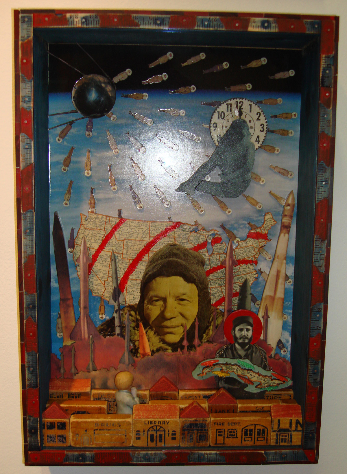
Bryan Gooding "Prayer at an End"
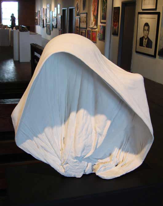
I have seen several of Bryan's works now and I always enjoy them. His assemblages are generally tough to photograph well since they are very three dimensional.
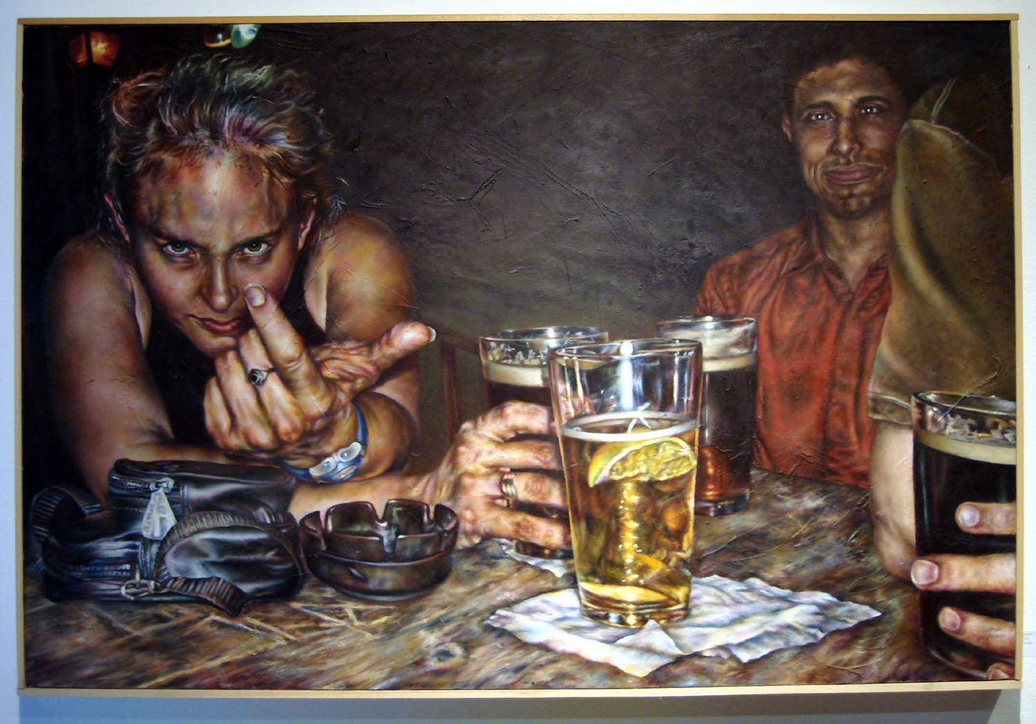
James Lassen "DSCN 1222"
Lassen's painting grabbed me when I saw it upstairs. It reminds me of when I lived in Deep Ellum and haunted various seedy establishments down there for many years. The title implies he painted it from a digital picture, it would be interesting to see if this is part of a series.
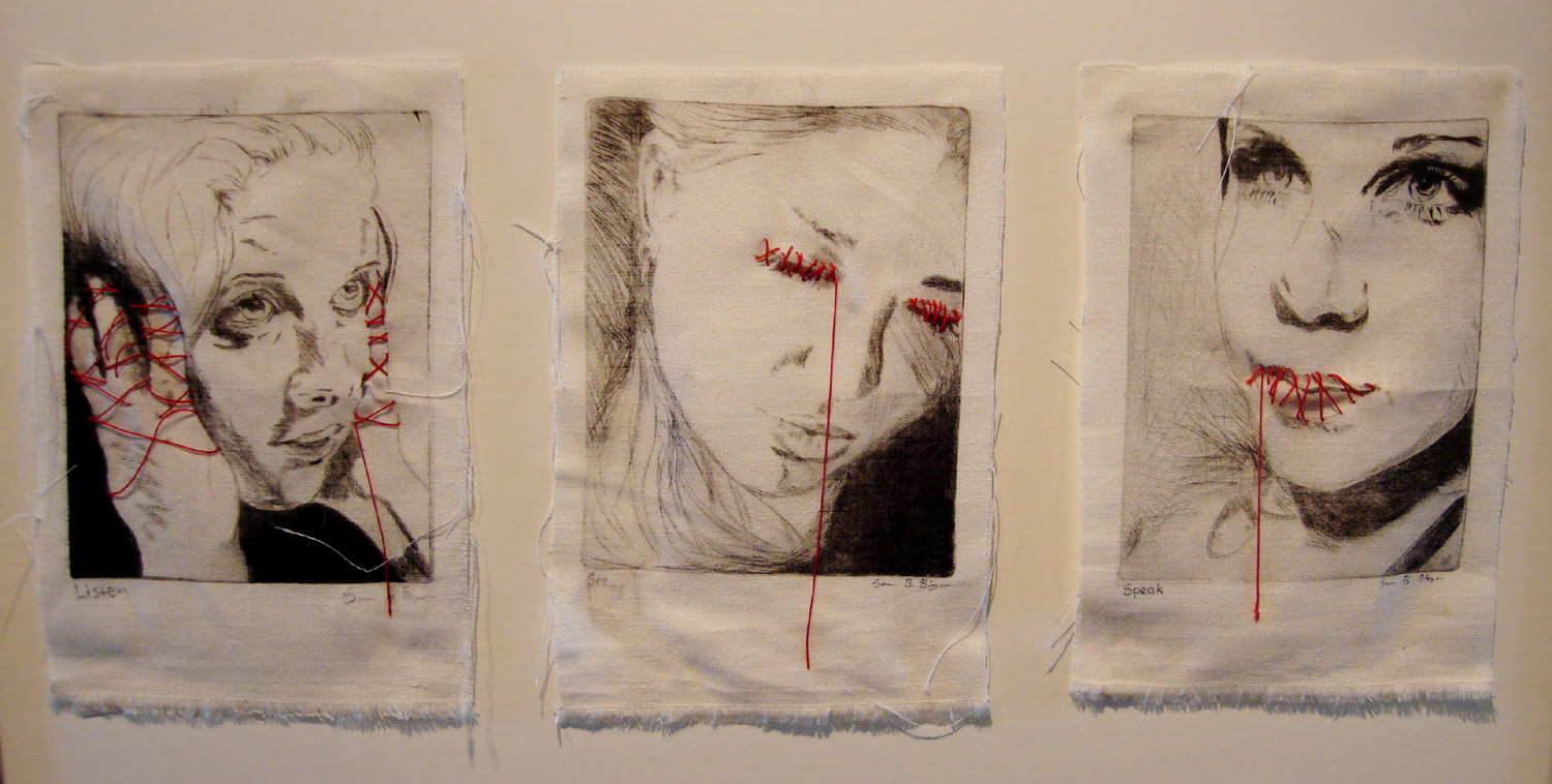
Samantha B. Blaydes "Listen: See: Speak"
Samantha's dry point on cloth triptych caught my eye. The red stitching is just right. While I have seen this theme done before, this work is well executed. She had a nice lino cut print "agony" downstairs as well.
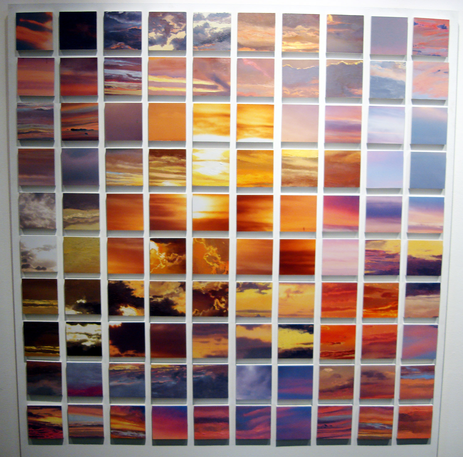
Meili Peterson "Roman Sky"
Having obsessed over the sky the better part of last year I was drawn to this piece. The color in this work is great and the grid format works for me.
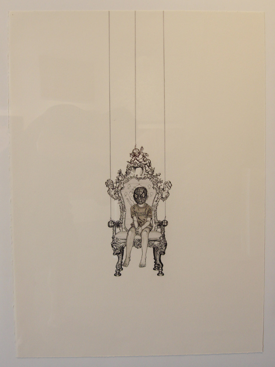
Nathan Porterfield "Throne" part of a triptych
Nathan Porterfield "Throne" grew on me over time. When I first saw the triptych it bugged me a little. I kept coming back to it though and it eventually won me over. The subject matter is quirky and great at the same time. His attention to detail and white space is immaculate. My photo of all three together did not turn out.
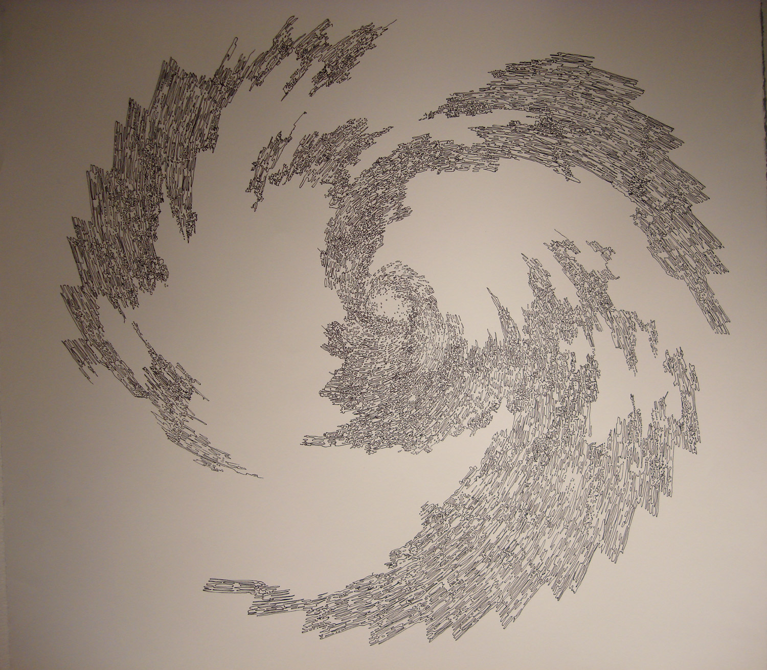
Todd Champlain "World Storm"
Camplin's "World Storm" is a really interesting pen and ink piece with fine detail.
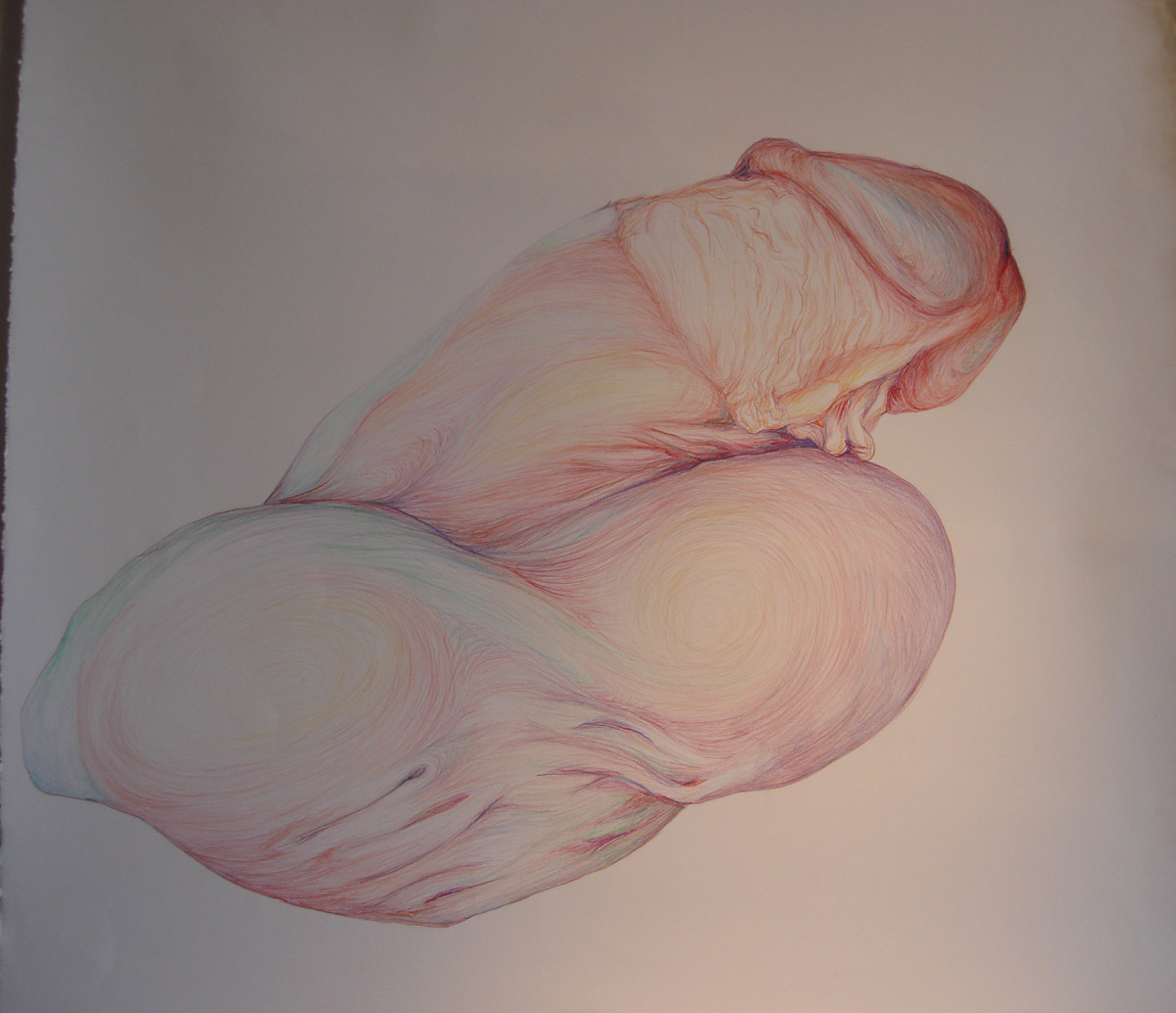
Jennifer Pilon " Viruh:Thrust
"
I loved the volumetric negative space of Pilon's piece. Not quite as fond of the scrunching at the very bottom of this work but overall it is very nice.

Loretta Gonzalez "Love Your Self"
"Love Your Self" was my wife's second favorite piece behind Bill Barter's. This work is a fun one and the captions on each tile are worth reading.
The show runs through the 1st of June so check it out before it is down. Its definitely worth seeing.
- July 2011 (1)
- December 2010 (1)
- November 2010 (2)
- October 2010 (2)
- July 2010 (2)
- June 2010 (1)
- May 2010 (1)
- April 2010 (1)
- March 2010 (3)
- February 2010 (3)
- January 2010 (3)
- December 2009 (1)
- November 2009 (3)
- October 2009 (2)
- September 2009 (4)
- August 2009 (3)
- July 2009 (2)
- June 2009 (3)
- May 2009 (2)
- April 2009 (1)
- March 2009 (7)
- February 2009 (1)
- January 2009 (3)
- December 2008 (3)
- November 2008 (4)
- October 2008 (5)
- September 2008 (2)
- August 2008 (5)
- July 2008 (4)
- June 2008 (3)
- May 2008 (3)
- April 2008 (2)
- March 2008 (7)
- February 2008 (9)
- January 2008 (5)
- December 2007 (2)
- November 2007 (5)
- October 2007 (5)
- September 2007 (3)
- August 2007 (4)
- July 2007 (3)
- June 2007 (5)
- May 2007 (8)
- April 2007 (37)
- January 2007 (6)
- December 2006 (7)
- November 2006 (9)
- October 2006 (11)
- September 2006 (12)
- August 2006 (12)
- July 2006 (7)
- June 2006 (5)
- May 2006 (5)
- April 2006 (4)
- March 2006 (8)
- February 2006 (4)
- January 2006 (9)
- December 2005 (3)
- November 2005 (3)
- October 2005 (6)
- September 2005 (9)
- August 2005 (11)
- July 2005 (9)
- June 2005 (14)
- May 2005 (3)
